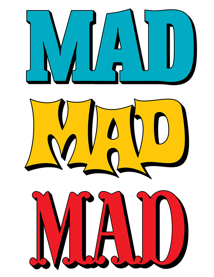
The West Coast rebrand of MAD included the redesign of its classic logo. Below are some of the other concepts that I created during the initial design stage in 2017.

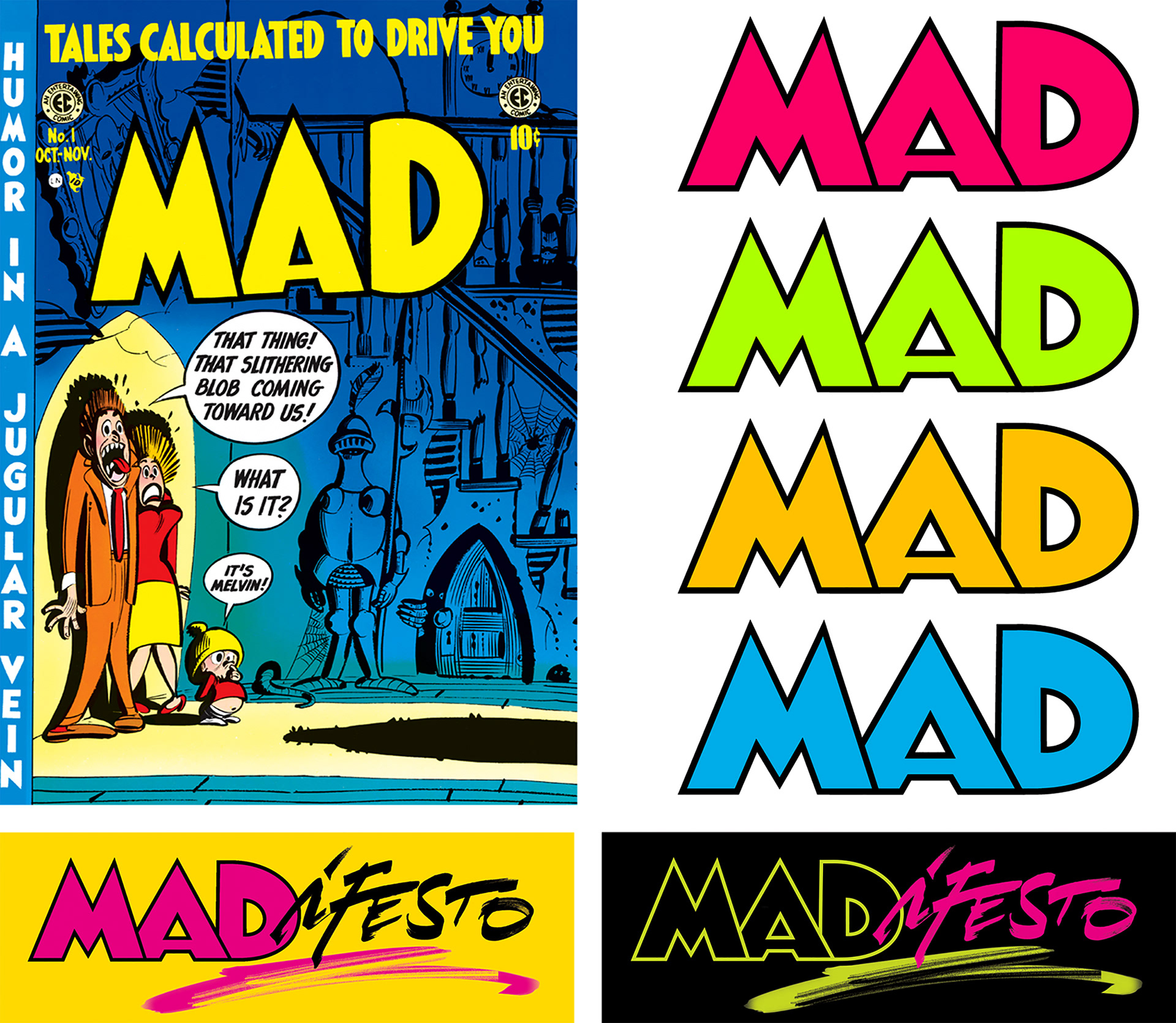
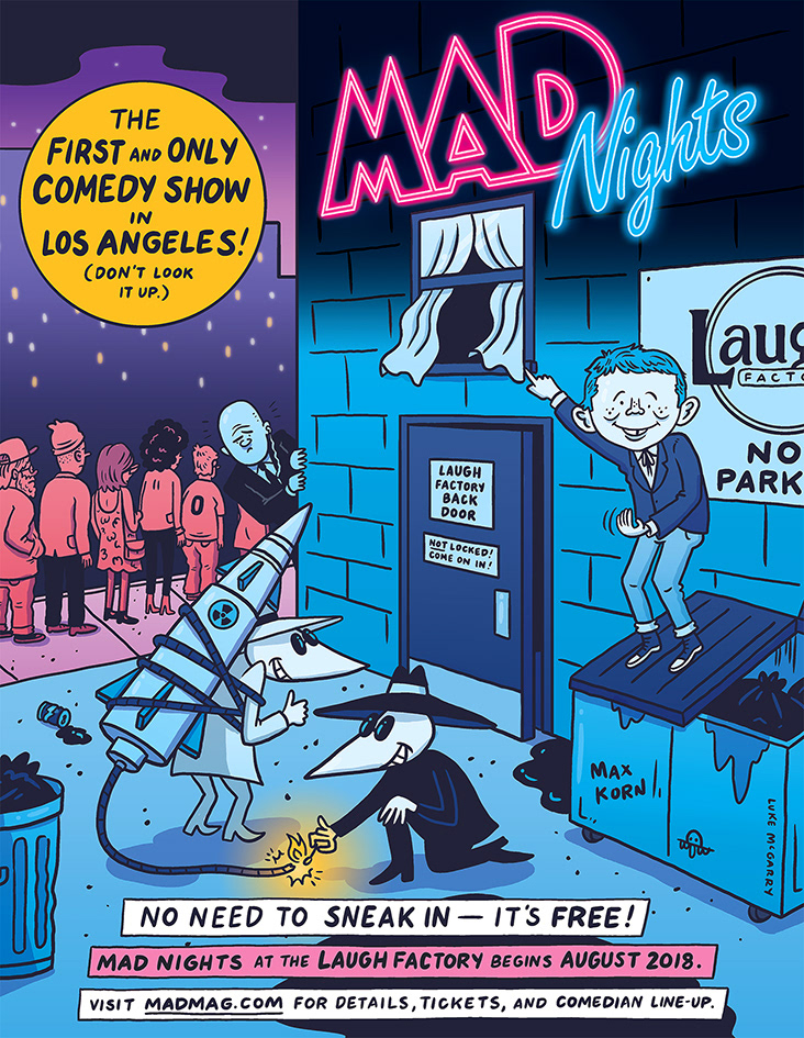
In the end, we went with a clear homage to Harvey Kurtzman's original, seen here on the first issue from 1952. The proportions were adjusted to better fit the current dimensions of the magazine, though the quirky spirit of the original was maintained. A new section of the magazine titled "The MADifesto" featured a combination of the new logo and hand-lettering, while "MAD Nights" utilized the neon logo from our first issue (see below).
MAD Business Cards

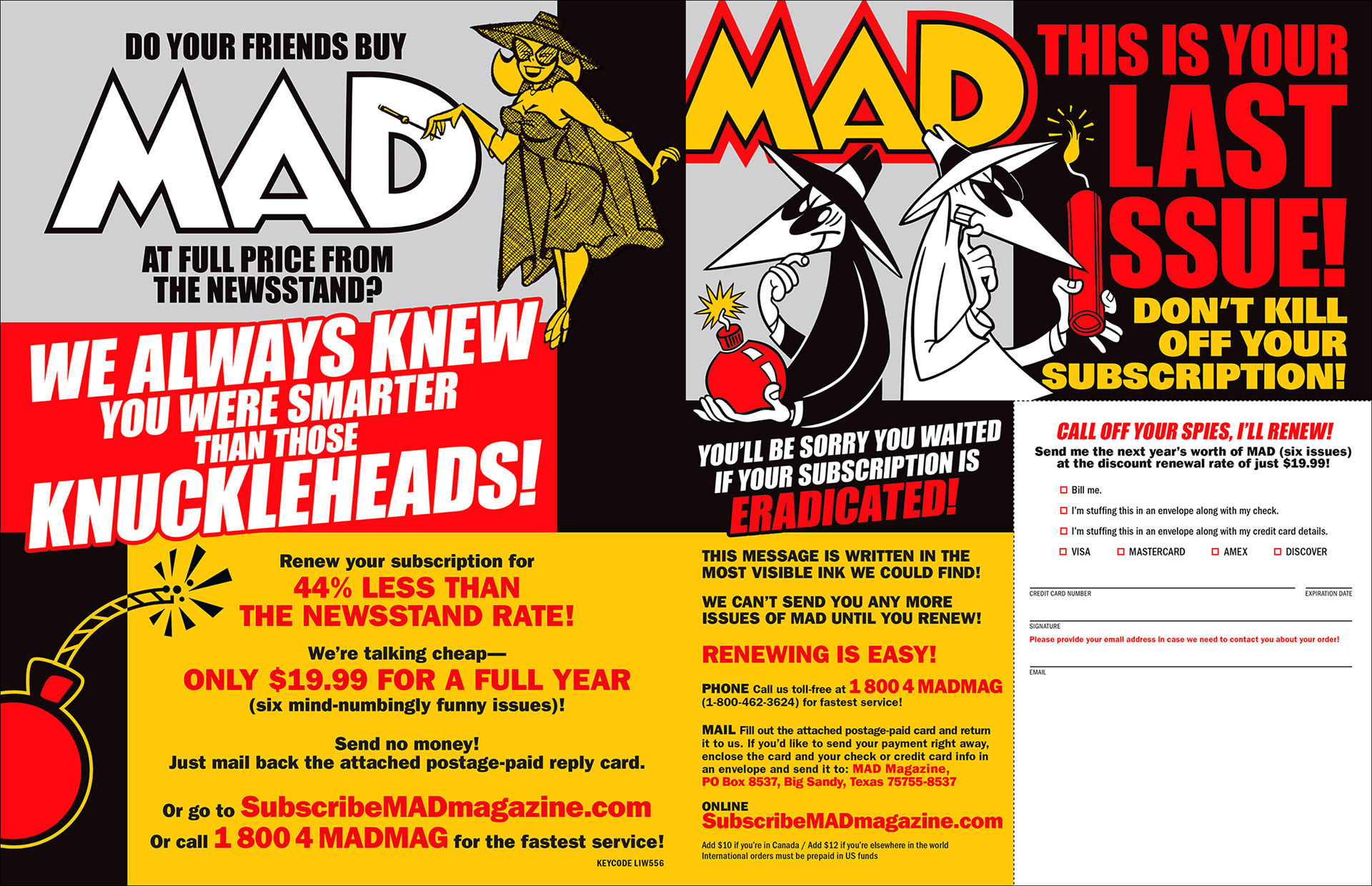
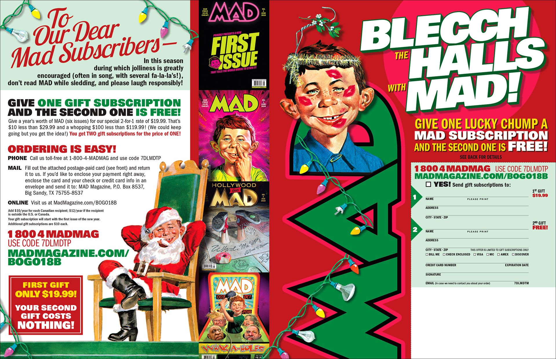
MAD Social Media Banner / MAD Subscription Card

MAD Subscription Wrappers
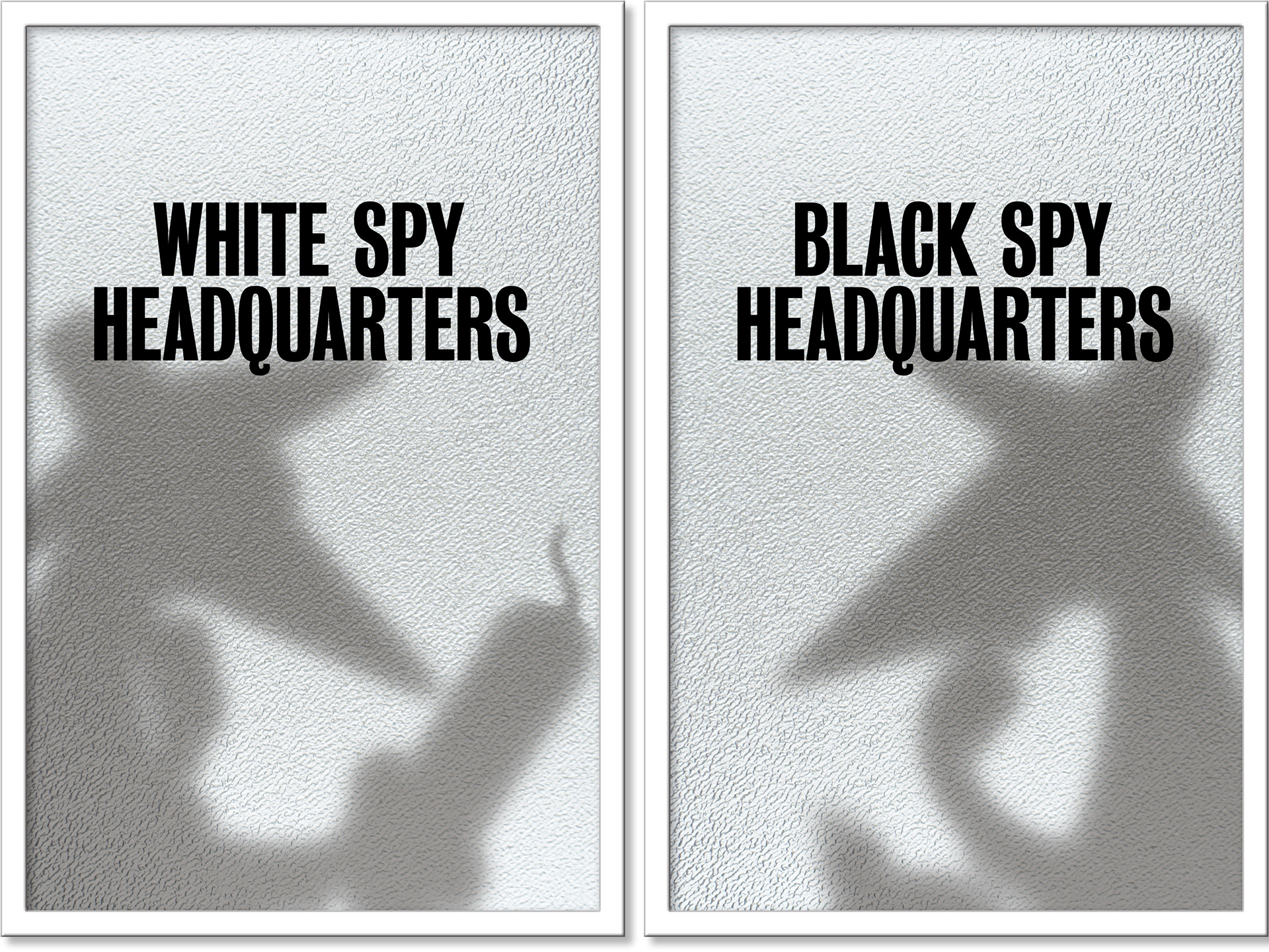
For the MAD offices in NYC, I designed these posters to hang on the doors of our printer room and stock room.